Advanced Interactive Design - Final Project
Kyra Binti Rizal Hamzah / 0337085 /Advanced Interactive Design / March-July 2021
Final Project
AR application and microsite for famous brand (Can use Taylors) for marketing and campaign purpose.
Final project are divided into two main area:
- Spark AR app
- Adobe Animate Microsite
Spark AR app
- An AR app for any famous brand (Example Taylors University):
+ Using "Fixed Target Tracker" for taylors logo/poster/merchandise tracking, which show AR graphic or AR map of Taylors
+ Using logic patch, to simulate a randomiser to make a "Where to eat in taylors" ar app. (lots of tutorial online for this)
+ Virtual graduation, AR gown and cap using "Face Tracker"
+ AR objects/designs that could be place in real world using "Plane tracker"
+ AR gallery, that could be place in real world using "Plane tracker" and let the user visit a virtual exhibition (Final Year exhibition)
- You can use Native UI Picker, if you could think of creative way to use them. like switching between graphic
Adobe Animate Microsite
- A microsite about the AR app you did
- No number of page requirement, but don't just do two pages...
- Some page/section idea that you can use (no need to do all, if you have better idea not in this list, you can include them as well)
+ Intro about the app
+ Objective of the app
+ Where to download
+ Step to use the app, etc
- resolution 1280x720 Landscape
* Both Spark AR app and Adobe Animate microsite should follow the same theme/design. Please record demo video of both microsite and spark ar filter.
Week 10
My idea for the project is to create an app that assists in navigating the Klang Valley rail system (LRT, MRT, KTM) . For the AR functionality, a user could scan their Touch n Go card and then the rail map could pop up.
I discussed my idea with Mr Lun and he said it would work but that I need to add some other features besides just the railmap to the app. What I came up with for that was :
- Date and time
- Weather forecast (so you can be prepared if it is going to rain along your journey
- Nearest station finder, with distance estimates and directions to the station via car, bus, or walk.
- Touch n' Go balance viewer and top up function
Inspiration & References (Week 11/12)
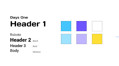
For the typography and colours , I wanted to make sure that I made choices that would be congruent with the branding of Touch n' Go itself.
 |
| The Touch n' Go logotype is very bold in weight, so I chose a header font (Days One) that was somewhat bold as well to complement it |
 |
| My next reference was the actual Touch n' Go app, which mainly serves as a platform for their e-wallet services as well as the ability to top up your cards (a feature I implemented in the AR app) . |
There were a few aspects of the app above that I tried to bring into my designs, such as:
- Colour: blues, gradient backgrounds for the header, with some white and yellow.
- Buttons with fully rounded corners rather than rounded rectangles
- The information hierarchy of the "total balance" section ; the reload button being designed with a button border while the transaction history, which may not be used as often, left as a text link.
 |
| Finalised style guide for both the AR app and the website to keep things consistent. |
AR app (Week 11-14)
 |
| Some icons I created for one of the app windows |
 |
| I settled on 5 screens- Date/Time, Touch n' Go balance, Nearest train station, Weather, and the RapidKL line map. |
 |
| V1 - Left aligned map, weather and nearest station together for easy viewing, and Touch n' Go balance up top as you may not need to use it as frequently. |
 |
| FINAL layout |
1- Given that each screen was meant to serve a function(eg topping up touch n go) or at least be read (eg the map or weather forecast), if they were to move it may not be as readable for the user.
2- A function I wanted to add was for each screen to be able to zoom in/out for easier readability rather than a user only being able to resize it by bringing their Touch N Go closer to their phone camera, and adding that animation meant that I could not add additional animation patches to the objects
Website (Week 12-14)
I finished the above by week 12 to give me time to do the website, but in week 14 I looked back at it to see if there was anything I need to fix and improve. The time I spent not staring at this non stop allowed me to look at it from a fresher perspective.
Week 12 progress of the app:
I felt like I could still give the app more functionality, so I decided to make use of the Picker UI function to allow a user to view more specific rail maps based on which train line it is. (LRT, KTM, MRT, and KLIA transit). This was not that difficult to add in as I just had to duplicate my map object and change the material/texture. Honestly it took longer to edit the different map pictures with different focused lines than it was to add it to the AR.
Week 14 updated version of the app:
 |
 |
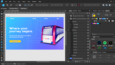
| For the About and Touch N 'Go pages on the site I kept the layout quite simple - header, text, and an accompanying illustration that is animated upon loading the page |
 |
| Finished design for the website layout (The scan page on the top right is meant to include a QR code of the AR app that I did not yet have during the mockup stage) |
After that I brought all my assets into adobe Animate. My plan for animating the site was quite simple ; I knew that the point of using Animate was to create a website with animation but through my other classes and my dissertation (which I also have been working on this semester) I learnt that animation needs to be quite balanced and suited to what your trying to convey. The branding of Touch N' Go is quite simple and "function over fashion" and it's the type of service that's more of a utility rather than something used for fun or as a luxury. That being said, the animations I implemented were mainly smooth and simple transitions of the assets moving and/or fading into the screen.
Final Animated Website


