
Major Project

Week 2
First consultation - Shared slides discussing my 2 ideas going with the project option of basing it on sustainable development goals, as some preliminary ideas I had were already going in the direction of social based topics anyway.
Feedback:
Idea #1 - Ideation tool for writing
Need to nail down a flow for the users have some sketches etc
Must make sure there arent other tools on the market
Possible to make it a brainstorming platform for anything not just writing ?
Idea #2 - UI guidelines for cognitive accessibility
Need to research more about the problems neurodiverse people face
Narrow down to 1 type or group of disorder/s
Week 3
Between the two ideas I decided to go with the writing brainstorming (idea #1) option as when I looked more into the accessibility guidelines for neurodiversity it seemed that a lot of the suggestions were in line with usability guidelines even for neurotypical people ( eg. Nielson Norman's 10 usability heuristics), so creating this separate guideline would be a bit redundant.
Expanded research for idea 1:
Feedback:
The idea is there but there still needs to be more justification
Now that there's an overview of other stuff on the market, do case studies and create sample scenarios of if you were to embark on doing this same thing within existing platforms
Come up with a list of what feature your platform would have, so you can compare to the existing ones
Week 4
I continued based on the feedback (slides in week 3 section - Slide 11 onwards)
Feedback:
In the long run if this was an actual product it might make sense for it to be usable for many cases and not just students (eg have many templates for different audiences) but as an MVP for the scope of this project its fine to focus on students
Can start working on the flow and user journey of using the product
Think of what platform this is designed for (web or software etc. web might be easiest?)
For week 5 can consult with either Mr Asrizal or Mr Razif or both
Note:
- Proposal presentation is now in week 8 instead of week 6 and focuses more on progress update / design proof of concept rather than being about finalising an idea
Week 5
 |
| Consultation proof |
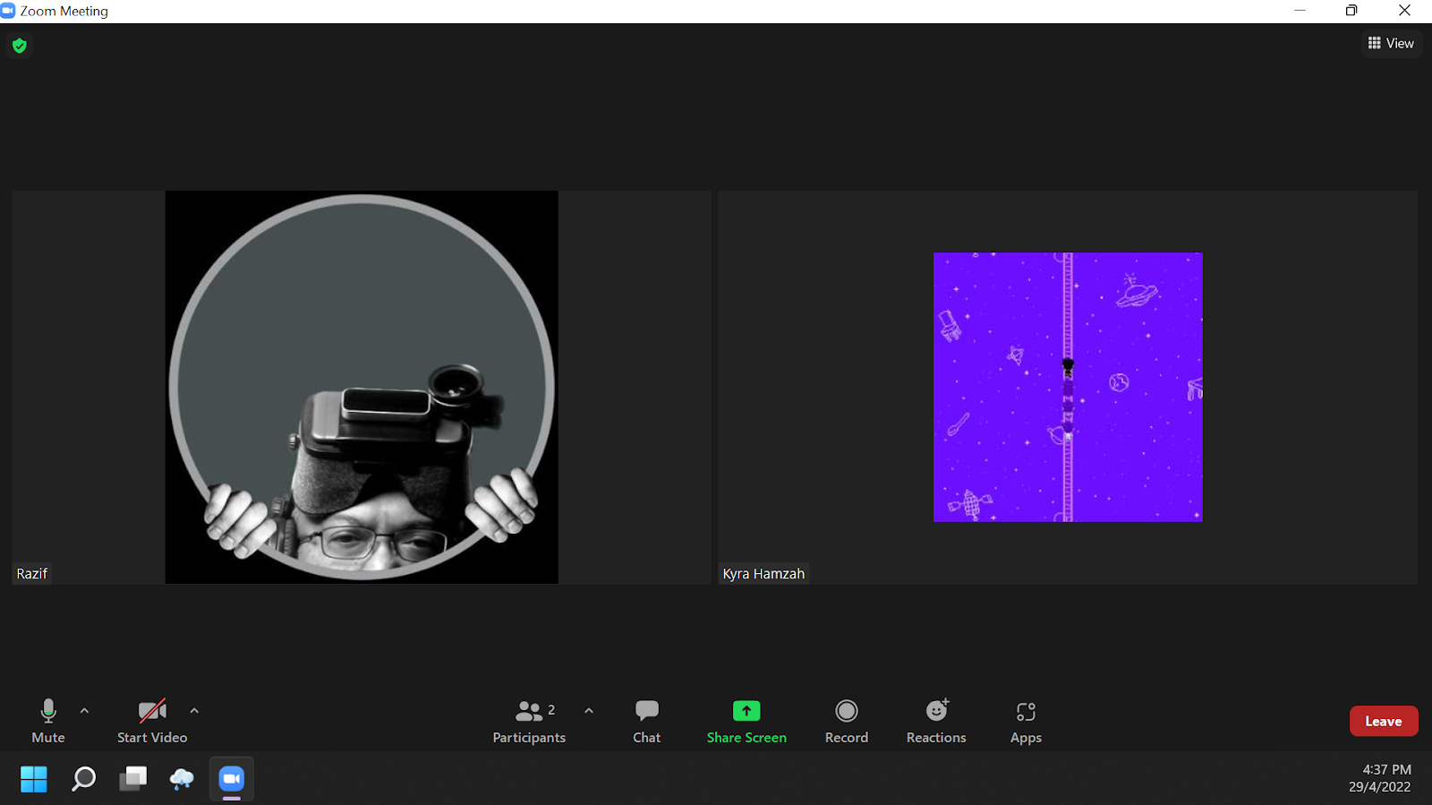
This week I started consulting with Mr Razif, so to start I went over the past few weeks progress with him. Then also showed the user journey map for the project (working title: unblank)
 |
| User journey |
 |
| Current progress on low fidelity wireframe |
Feedback:
Spend more time to think about the tools and guidance in the brainstorming and organising phases.
Even if you provide an open space to brainstorm there is still the risk of getting stuck on not knowing how to brainstorm, so look into some techniques such as SCAMPER or any other ones
It may also help to add examples or more description in the organise phase. What is an introduction? What is a body paragraph?
Week 6
Following last week's feedback I looked into a number of brainstorming and ideation techniques that may apply. I first narrowed down a few that are feasible for individuals (many techniques online are designed for teams) and then considered them in context of the types of writing questions students typically face in high school based on some past year exam papers.


Week 7
.png) |
| Consultation proof |
 |
| Further progression on the wireframing from last week |
 |
| Style guide for the high fidelity mockup to come |
Feedback:
- Since there is no technical restriction as this will just be a prototype, see what other features you could potentially add to this
- For the presentation next week it may help to have a more visual mockup of one of the screens to give a clearer proof of concept
Week 8 - Presentation
For my presentation, I put together a summary of the research conducted so far and the current wireframing progress
Feedback: No need to do the flash cards, instead a better additional medium would be to make an accompanying mobile app design that could work concurrently with the desktop one.
Week 9
This week I began working on the high fidelity prototype for the full desktop flow

Feedback:
 |
| To make the progress bar more fun I added a rocket illustration. Feedback to this was that all the other imagery in the app should be aligned and have the same theme |
- For the writing step (image above) there should be some sort of indicator in the text processor to show which phrases were taken from idea cards and which ones were typed in manually. This could also be toggled on and off in case the colours make it too hard to read through the whole text
- For the mobile version, think of it as a companion rather than an alternate use case - maybe mobile can only have the brainstorming and organising steps and not have the writing one itself
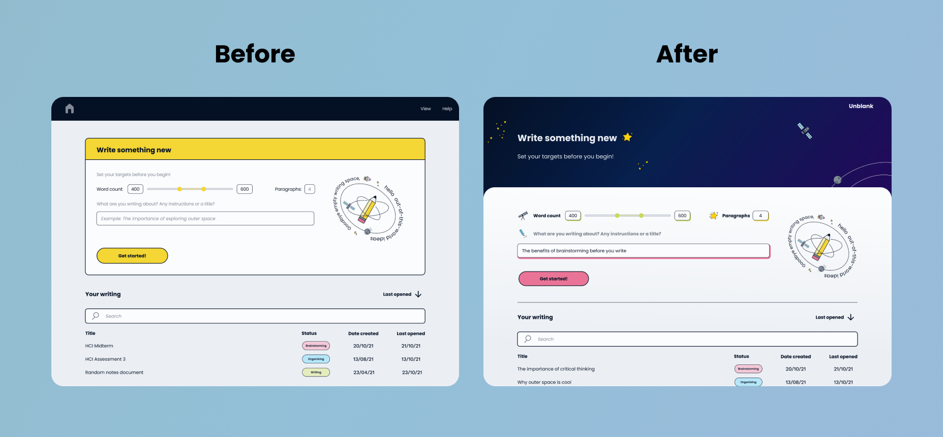
Since the next step involved improving some of the visuals and aligning a theme I started by creating this key art ; The reason for the space theme is a play on words. One of the initial goals when starting this project was to assist students in overcoming blank page anxiety or the feeling of not knowing where to start as writing typically begins on an empty space for you to fill with your content. Long story short I wanted to correlate the empty space on a page with outer space.
 |
Week 10
 |
| Target for this week is to finish high fidelity for both desktop and mobile. Since I already had created the components for the desktop version, I skipped doing low-fidelity for this to save time and just went right in with the UI design. Here is the mobile version! |
Week 11
Continued with the small icons to be added throughout the prototype (as per the style guide earlier on they were a bit random : a star, key, magnifying glass, and pencil) I maintained the pencil and star but changed the others to create more cohesive branding as Mr Asrizal also mentioned that that needs work.
I made the strokes for all of these using a preset brush that imitates penstrokes to give a bit more a of a doodle feel to go along with the initial style intended.
 |
| Updated keyart, now including a tagline that sort of sums up the whole theme as well |
 |
| Icon for the writing section |
 |
| Alternate pencil icon to be used in the button for creating a new document |
 |
| Icon for organising ideas - rocket blastoff to symbolise starting the journey |
 |
| Rocket icon for the progress bar |
 |
| Satellite icon to portray conveying a message, used in the portion of the "brainstorming" screen where you start coming up with ideas on cards - In an earlier version of the wireframe this was done with the pencil icon, but I changed it to avoid confusion as the "writing" screen also uses a pencil icon |
 |
| Star icon for the Keywords section in "Brainstorming" - initially it was a key icon for a more literal visual but I changed it to this to match the theme |
 |
| For the Related Words in "Brainstorming" - it used to be a magnifying glass to signify taking a closer look, so I felt that a telescope would fit the similar meaning while matching the space theme |
Besides that this week I did more research on doing microinteractions in Figma prototyping.
I've known about the smart animate tool for a while but didn't know that the type of animations use vary based on how your layers are named and the layer hierarchy. This was a major problem cause I always forget to name or arrange anything.
I also didn't realise the number of different triggers that are available now as I have only used the "onclick" in the past and never really explored the others.
Figma is my best friend now.
(I guess it's worth mentioning why I'm using Figma to do the interactive prototype? I initially planned on doing it in Ae or Animate, however Ae won't be interactive and will only create a video, and using Animate, while it gives more freedom and control over my microinteractions, might be super time consuming to do as I would have to recreate all of my layers and everything. I also looked into Figma-to-Adobe workflows and plugins, and while there are resources for After Effects there aren't any for Animate)
.png) |
For my consultation this week I mainly explained all of the above, so there wasn't much feedback besides "ya by right you should name your layers properly" HAHA . We also discussed exhibition matters like how I plan to display the work, especially as there is now two prototypes one for mobile and one for desktop. For desktop I might put my laptop there so that you can click the Figma, and the options for mobile for now are either the same as desktop (Borrow Mr Razif's spare phone) or to have a scannable QR for people to open on their own phones. However, there might be scaling issues to do so on other phones as Figma is not exactly responsive.
Week 12
Feedback:
The mobile version still looks a bit like a wireframe and not like a finalised interface so try play around with it a bit more
The mobile version still looks a bit like a wireframe and not like a finalised interface so try play around with it a bit more
To fix this I spent some time thinking of how to both fill up the screen, and also continued thinking of ways to implement the branding visuals. In the end, I gave the homepage and creation page a section just for the header text that also includes some fun visuals that also make the app more exciting and fun to use.

Week 13
Feedback:
Desktop version : Organise screen - Think of the design for the expand/collapse button, make it a bit more clearer in function
For the exhibition make sure your board includes the story behind the design of this project, so you are showing the UX and the ideation process and not just the final UI
These pictures are not related to the feedback above, lol. Too many minor details being changed for me to document them all. But to follow up from last week's progress, I got concerned that the new design of the mobile version was getting too far removed from the desktop AKA main platform. So after some messing around I found a way to correlate the homepage of the desktop one to the new design, as the old one was a bit... blocky?
This week I just continued to work on the interactive prototype. During consultation there was little feedback as well.
Since the visual design at least is done, I also sorted out the design for the display board for the exhibition.
Week 15:
 |
Links

