Kyra Binti Rizal Hamzah (0337085)
Design Principles
Final Project
In preparation for this project, I went to Bukit Bintang (simply because it was easy to get there via MRT) and walked around for a few hours. I took LOADS of photos but I don't think I'd be able to fit them in here, but I did make some notes on the photos I took before I started planning my piece so here they are.
 |
| In this first page I mostly talked about my trip overall and my experience riding the MRT. I take the MRT a lot, but it's rare that I take it to the city center and it was different from taking it elsewhere as due to my destination and my timing, the train was packed with people headed to work. |
 |
| Some photos from my trip and some thoughts. |
 |
| More photos and stuff I wanted to jot down. |
 |
| Once I had an idea of what to do, I sketched it out |
 |
| I should've taken some progress photos earlier on but I forgot. Anyways here's the main elements of the piece. I added the halftone pattern in the corner as I saw the doors to the MRT were framed with a similar pattern. On a similar note, the crowd going up an escalator I drew was based on what I saw when I got off the MRT (I wrote about this in my notes earlier on too)The cars I added was to represent the road I got stuck at for a while trying to cross but I had to wait for the traffic light XD The staircase was just a fire escape in the back alley of a shoplot I walked past, and the black rectangles with yellow circles represent this row of posters I saw near the MRT station. |
 |
| Added text (which I later redrew on), moved the escalator, started drawing the background. I drew some shoplots I walked past in the background as that's what I mainly saw in Bukit Bintang once I stepped away from the mall area of Pavillion/Fahrenheit88/Starhill. |

Rationale: Despite KL being my hometown, I don't visit the city center very frequently; if KL is brought up in a conversation, I think of the view of KLCC from my balcony, which is why I drew that in the foreground of the image.
The malay idiom "katak bawah tempurung" plays a big role in my piece. It means to be living in a bubble, unaware of your surroundings. I felt that this idiom resonated with the way I'm unaware of the city I'm from as well as my disconnection from culture and tradition as me and my parents are from the city, thus my sentiments are more urban rather than traditional. I included the idiom in my piece by illustrating it as graffiti on a wall, as I was inspired by the murals and graffiti around the city. That same inspiration also led to the choice of art style and bright colours I used in my composition.
The other elements in this piece represent things I saw throughout a morning I spent exploring Bukit Bintang, but instead of including very monumental aspects of the area I chose to use things that represent my roots in the city; shoplots, traffic, and a few minor visuals inspired by things seen in the MRT station. I wanted to fit a variety of things into my piece, compositionallyoverlapping each other to both represent traditional woven handicraft mixed with modern visuals, and to also depict the way I had to weave my way in and out different parts of the area.
Project 2: Self Portrait
 |
| It was hard to start sketching immediately so I wrote a lot to think about how I see myself and how others do as well |
 |
| Then I started to look for pictures that inspire me, from video games to a painting in my house, movies and comic books. |
 |
| I also included some photos I took in KL of street art that I liked for their colours and style |
 |
| Then I started sketching and thinking of ideas I could incorporate in the portrait |
 |
| I wanted to use some of this coloured cellophane I found so I included it in my sketchbook with some swatches of paint colours I considered using |
 |
| I then painted the main part of the portrait, my hijab but stylised. I wasnt sure how I wanted the edges to look so in the end I scanned it and edited it digitally. |
 |
| The background of the portrait that I made digitally |
 |
| Added in the painting scanned earlier |
 |
| Turned the background upside down as I felt that it looked better like this with the end of the hijab seeming to appear from the circles (intended to be like the orbits of planets) |
 |
| I then printed the digital parts and started adding the other parts that I wanted to do on paper (paint, plastic collage, oil pastel) |
 |
| As you can see from the lighting, I was working late at night |
 |
| My finished piece :D |
Rationale: In this piece, I wanted to depict both external and internal parts of myself. I created the background digitally to include a cityscape inspired by videogames I like, and the solar system because I enjoy science fiction. I printed it out, then used traditional media atop it to create depth. I painted my tudung(headscarf); a part of my external appearance tied to my personal beliefs, in a style inspired by graffiti I saw around the Pasar Seni area, using fiery colours symbolising my hot-headed tendencies. I painted exclamation marks to show that I'm loud, and a mask instead of my face to signify that I hide a lot about myself; I tend to see things proverbially in black or white, thus I coloured it as such. I used cellophane to imitate a glitching screen to visualise how my anxiousness makes me feel when it interrupts my thoughts.
I also wanted to express my views on identity within this piece; squiggles in oil pastel and marker signifying that self perception can be more abstract than archetypes suggest, and nicknames and misspellings of my name to show that no two people see you the same way. A final thing I added was the message when a phone call doesn't connect, written out with the wording changed to convey disconnection from identity, which is how I felt when putting together this piece. I chose to include this message in Malay to express the detachment I feel from from my mother tongue and culture.
Troublemakers Colloquium
On the 8th of November we attended this event held by the design school. One talk that particularly stood out to me was by Ms Ezrena Marwan from the Malaysian Design Archive. She spoke about the history of design in a Malaysia context and presented a timeline of designs in Malaysia alongside historical events such as the British and the Japanese rule over Tanah Melayu as a way to observe what has influenced Malaysian design. She began her presentation with a picture of a logo featuring a rooster, which has made a recurring appearance in Malaysian designs over time. She later concluded her talk by bringing everything back to the rooster; the only thing in history that has been able to be pinpointed to it being the serama rooster, a breed of rooster described as brave warriors that was said to have been given as a gift to Kelantan by the King of Thailand.
Essay- Southeast Asian Designer.
I wrote my essay about a designer that isn't Southeast Asian (he is from Taiwan),but is currently based in Southeast Asia. I chose to write about a UI/UX designer as that's what I plan on doing in the future.
Week 10- Symbol, Images, Words.
Symbols:
Signs, icons, shapes and concepts can all be used as symbols. Gestures are also a form of symbol, but gestures can hold different meanings in different cultures. Besides that, colours can symbolise feelings, but these too can have a variety of meanings (for example, red can symbolise both anger and love).
Images:
A representation of external forms of people or things in art, first captured by your eyes.
Examples-
2d images- photos, images on a screen
3d images- statues, holograms.
Vector images: digital images created using mathematical statements.
GIF(Graphic Interchange Format) image: Moving digital images typically used on web
Monochrome image: Uses one colour in different values and intensities
Grayscale image: Like a monochrome image, but it's only made up of black, white and gray.
Words:
In design, words can be used to convey a message for example in signs. Therefore, they have to be used in an appropriate size, colour and font in order to be readable.
In typography, words are the main content and can have graphics included as an aid (Contrary to in design where the words are the aid to the graphics)
I was a bit stumped when I was trying to plan what to make for this week's exercise, so after a long period of taking random photos and walking around, talking to my classmates, I decided to make a GIF to express my lack of ideas.
 |
| The GIF image I made |
Week 9- Gallery Visit
This week we visited Ilham Gallery in KL.
Click here to read my essay about the gallery visit
Week 8- Rhythm, Movement, Harmony
My group presented this week's topics.
Jia Yi, Hillary and Ke En made the slides, then me and Anita presented them to the class.
This week we made collages, so I used some papers I had lying around ( I actually like making collages in my free time so I had the materials on hand and this exercise was particularly fun for me)
For my collages, I started by laying out the paper scraps I had to plan how I would stick them, before actually assembling the piece.
 |
| The finished piece- I wanted to show progressive rhythm through the vertical strips of paper with different patterns (scrap paper from a marbling ink piece). |
 |
| The other piece I made(which I forgot to take progress photos of... I need to stop doing that. I get a bit carried away at times). For this one, I wanted to show harmoney between adjacent colours on the colour wheel (I used blue, purple and pink). I also added some orange pieces to it despite orange being totally opposite blue on the colour wheel because compositions that are completely harmonious can turn out monotonous, so I used the contrast of the orange to strike a balance in my composition. |
Week 7-Dot, Line, Size & Scale
A dot is the smallest part of a design and they can form a variety of arrangements and complexities. They can become lines or curves, and show directions or movement. Lines can show direction and diagonal lines suggest movement. Caligraphic lines are lines that are intentionally drawn while implied lines are lines that you can see when objects are arranged and show a line.
Scale describes the dimension of drawn objects. Scale can create contrast, emphasis, show proportion or visual hierarchy (which can tell a story), structure and order.
Size can show visual hierarchy. Bigger objects have higher visual hierarchy while smaller ones have lower hierarchy.
 |
| Progress of my painting; I did the dots one colour at a time and layered them over eachother (Unfortunately I forgot to take a photo of the sketch beneath the painting) |
 |
| My piece using gouache paint. |
Week 6- Alignment, Direction & Perspective
Based on my understanding alignment refers to how parts of a design can line up in relation to one another or to a specific segment of the page/design. Direction is the way a composition leads a viewers eyes from one component of a design to another. Perspective is a way you can depict three-dimensional visuals even when you are working in a two-dimensional medium.
For my piece this week, I decided to show alignment.
 |
| Some recycled materials I gathered; snack boxes and wrappers. |
 |
| I first cut out pieces of some of the boxes and tried out different ways to align them. |
 |
| More experimentation with the composition.. I wanted to align the top half of the piece to the left. |
 |
| Added the plastic pocky packaging from inside the box to the left side and changed the composition a little bit. |
 |
| My piece- besides the alignment of the top half, I wanted to align some pieces going from the top to the bottom of the paper along the right side, so I used another cutout of the plastic and aligned it with the pink piece of cardboard above it. |
 |
| The way I tried to align the parts of my piece. |
Week 5- Pattern, Repetition
 |
| Sketches and tests of a carved piece of lino |
 |
| More lino tests. The design I used for my piece. |
 |
| Final lino tests after carving the lino deeper to make sure the design shows. |
 |
| Pattern made with lino stamp and metallic acrylic paint |
 |
| Pattern made with carrots and acrylic paint. |
Week 3- Symmetry, Balance
 |
Sketches; I had a lot of different ideas in mind, and had a tough time figuring out what to do as balance and symmetry are principles that you could create anything with.
|
 |
| Outcome 1- I wanted to show balance between vibrant colours in the sky and more muted dull colours in the tunnel |
 |
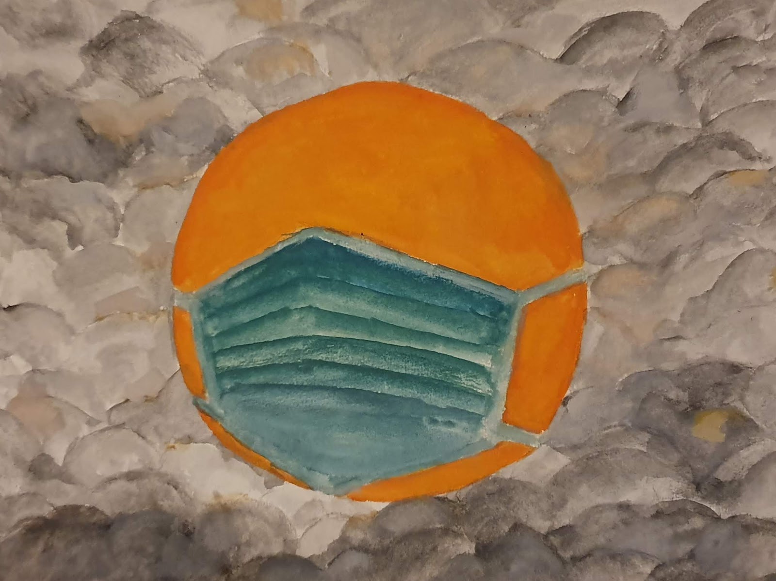
| Outcome 2- Balance between the grey and the more vibrant orange and green. Since it was hazy this week I painted the sun wearing a mask, surrounded by the hazy air XD |
Week 2- Gestalt
 |
| Sketches for my ideas to show gestalt. I had 3 ideas; one using silhouettes of faces, one using clothes to show a head, and one using stairs to show legs. |
 |
| Sketches part 2. |
 |
| Outcome 1- A beanie,turtleneck, and glasses that could show the silhouette of the head. |
Ms Sherry mentioned that 2 of my pieces (Outcome 1&2) could fit together to be one person and asked if it was intentional.
Ps: It wasn't XD
 |
| Outcome 2- Used Gestalt to make the stairs show the shape of the legs, and the parts of the shoe show the silhouette of the shoe. |
 |
| Outcome 3- A person, with both the shape of their face and their hair being made up of silhouettes of more faces/ |
Week 1- Contrast
Ms Sherry briefed us according to the MIB, and instead of the usual stand-up-and-tell-us-about-yourself style of introduction, she made it into a fun activity; we had to pair up and ask our partner a list of questions and then draw a portrait of them. She also delivered a lecture about contrast and showed us a few examples of contrast in colours, sizes and patterns. One example that particularly stood out to me was a picture of a group of orange goldfish facing one direction, with one lone green fish facing the opposite direction. It's partly just because I like fish, but besides that it was also a picture that could depict individuality and being different.
The exercise we were given this week was to make a composition that depicts contrast out of black and white paper. I started off by looking up some more examples of contrast, and brainstormed a bit based on things I found.
 |
1.1- Brainstorming: Left side- picture examples, Right side- sketches
(I unfortunately couldn't scan this as I did it on A3 paper) |
I initially did 4 small sketches (pictured above) and struggled to figure out whether my initial ideas could really show contrast or not, and in the end I decided to combine a couple of my ideas into one. From there, I did a couple more sketches to experiment with the composition, before I produced my final outcome by cutting black paper and sticking it onto a piece of white paper (pictured below).
 |
| 1.2- Contrast final outcome |
I tried to use contrast in this composition to show the different faces of a building being viewed from the side, making one side white with black windows while the other was reversed to make it appear like that side is in the shade. I also wanted to show contrast between the straight and geometric nature of a building and the more organic silhouette of a person, that mainly consists of more curved lines.
Feedback: We had to stick our work up on the window in the classroom and present it to the class, and Ms Sherry asked if I was interested in architecture based on my explanation. She also mentioned that my idea of using contrast to show the shade and perspective of the building corner did work as I intended it to.


